Pre-design Thinking
The intended audience of 'Compete' consists of athletes, sports professionals, amateurs and active people.
People can use the original sports drink to gain back the glucose, fluids, and electrolytes such as sodium, potassium, magnesium, and calcium
lost during exercise and workout as well as to improve endurance. The pre-workout energy drinks can be used by athelets to give their body a boost to perform best during their exercise or
to recover faster after an exercise. These energy drinks can also be used by anyone who needs an extra boost in energy in their daily lives. The protein shakes can be used for multiple reasons, including muscle gain, weight loss, and injury recovery.
Thus, I've decided that I want these sports drinks to be consumed by everyone, and not just athletes.
In this session, I've concluded that:
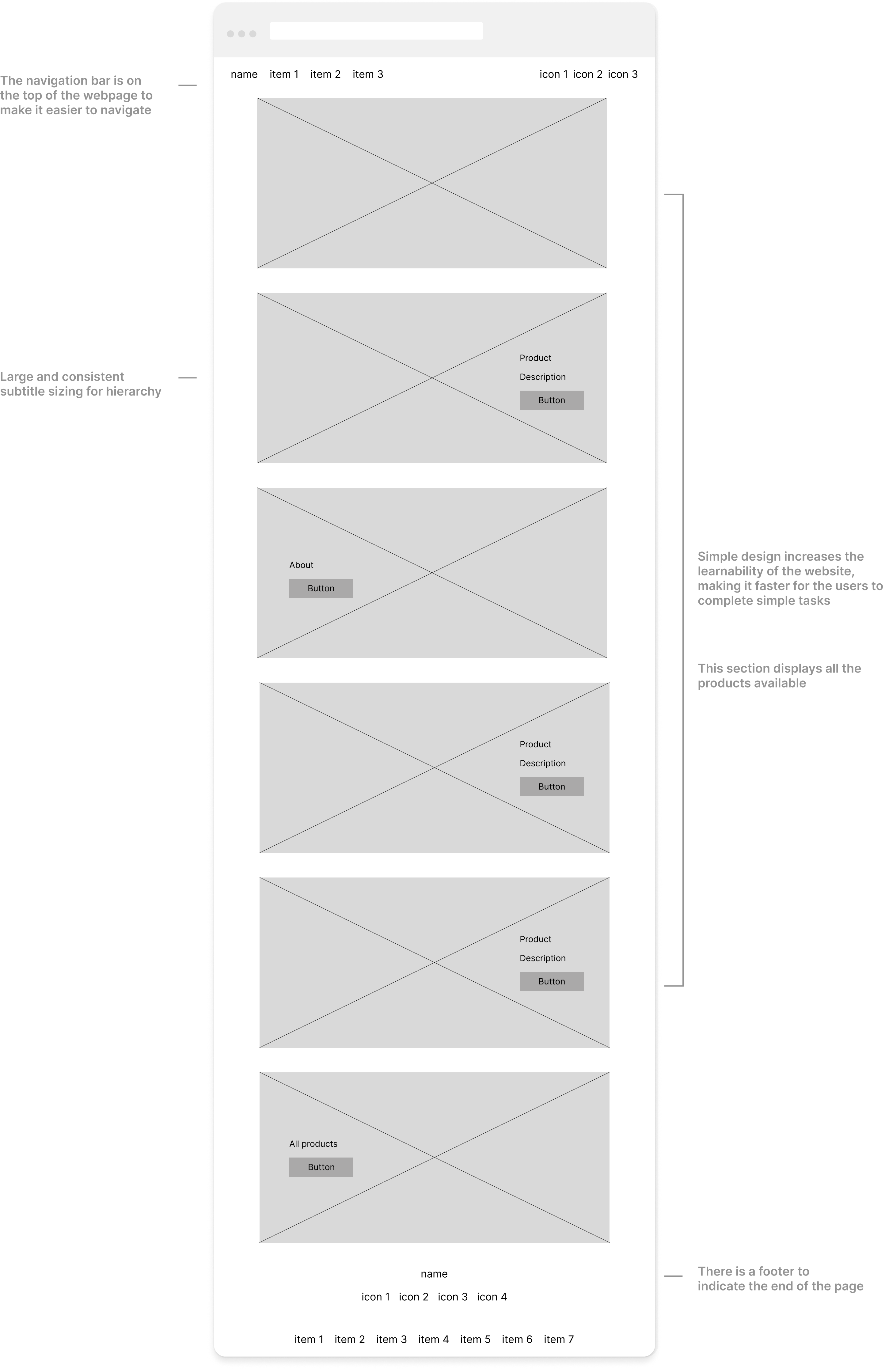
- The design of the bottle and the label should appeal to everyone. By keeping the packaging simple and minimal, the brand can reach to a broader
audience and not just target towards athletes and people interested in fitness. By designing simple yet unique packaging, the brand can catch the interest of the people who may not regularly go to the gym but are still interested in leading a healthy lifestyle.
-
The bottle should only include the most important information on the front. This way, customers can quickly understand what the product is and how to use it.
This would also be helpful for people who are not familiar with sports drinks, pre-workout drinks, or protein shakes.
-
Different than other sports drinks brands, the bottle can be made out of recycyled aluminum instead of plastic. It would be sustainable and more environmentally friendly
than plastic. It would generate less waste and support plastic free movement.
Overall, simple and minimal packaging would be accesible, intuitive, and environmentally friendly, making it appealing to
a broad range of users.
Designing
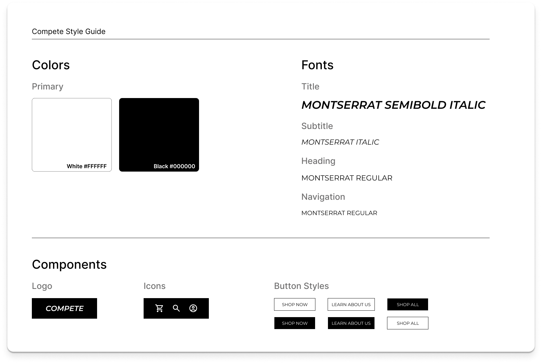
I aimed for a clean yet unique look, which separated the brand from other
sports drink brands available. By using different colors for the packaging of the products, I created a visual differentiation
to help users easily identify which product line they are looking at.
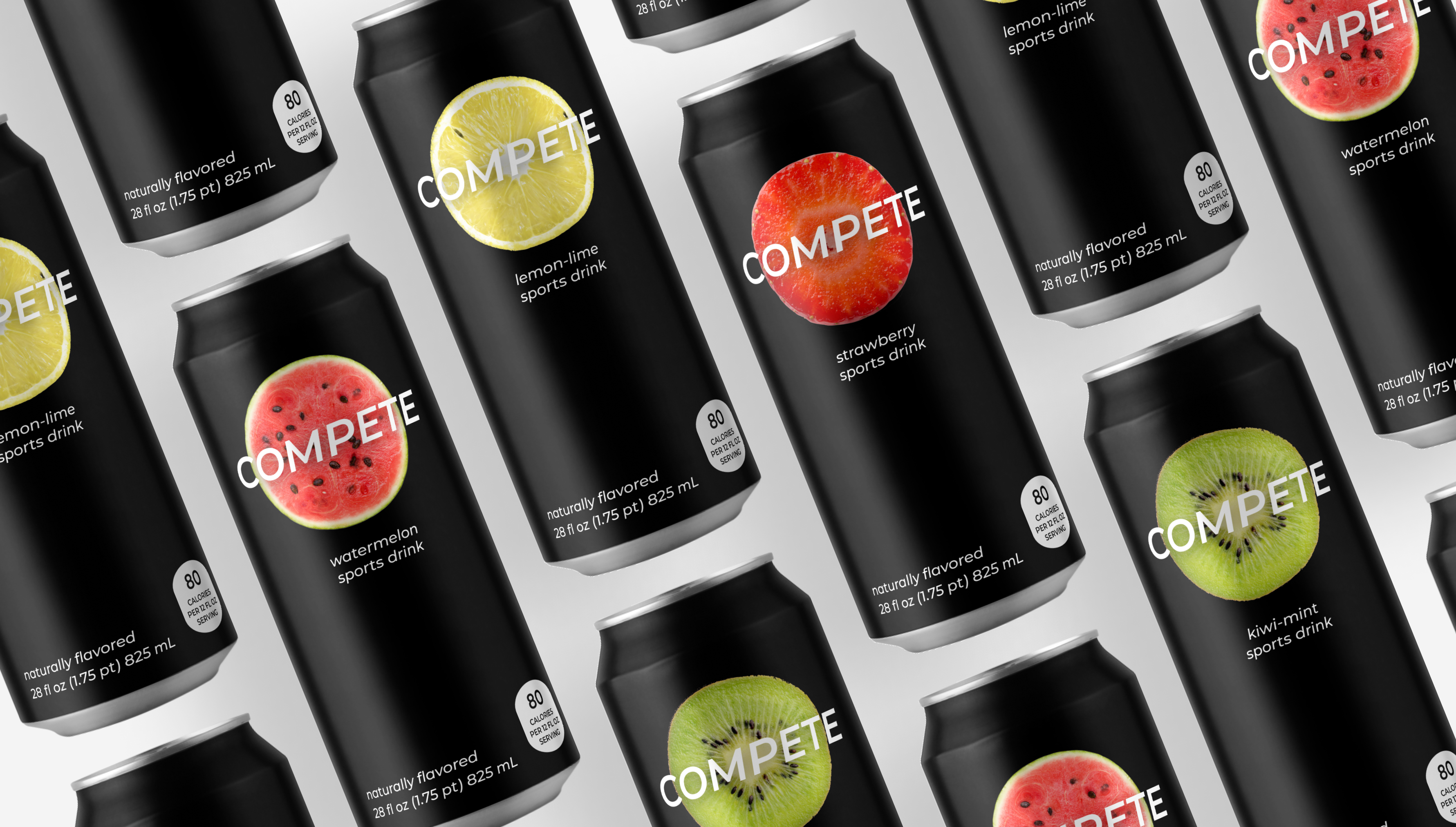
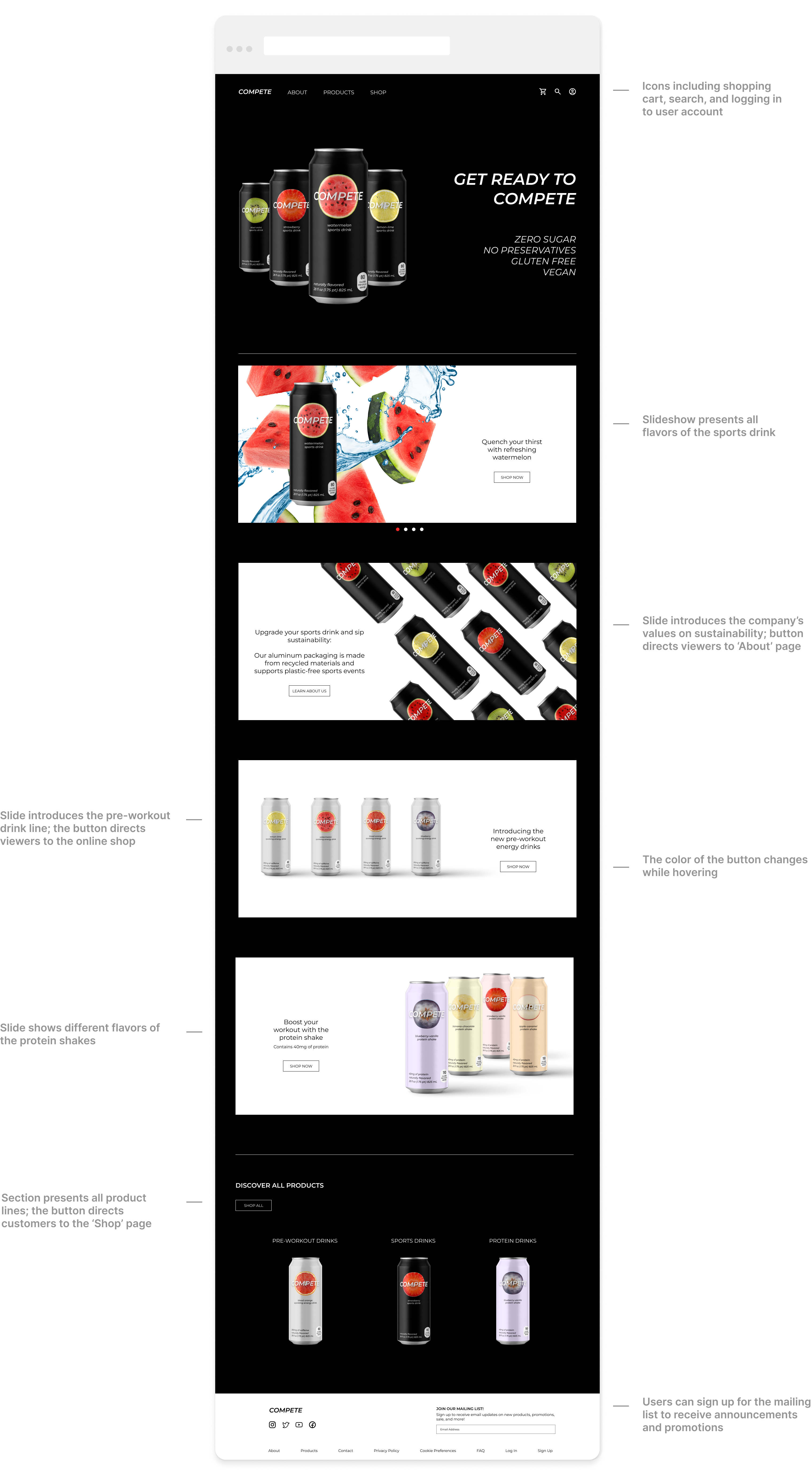
For the sports drink, I chose a black backgroud color. In the context of sports drink, the color black represents power, endurance, strenght, and intensity.
The black packaging states that it is an effective product.
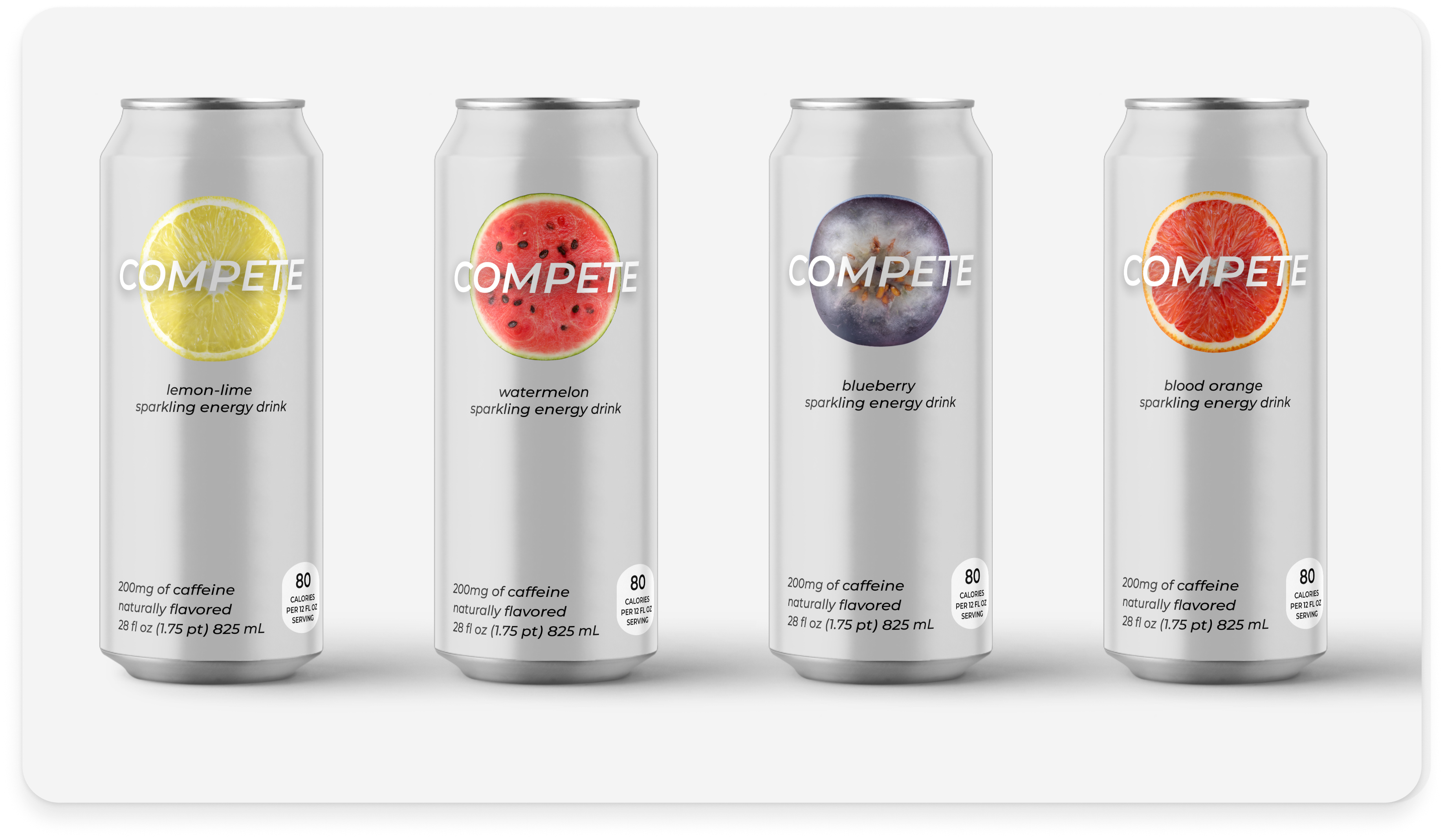
For the pre-workout drinks, I decided to use a silver background. By choosing a different color than black, I stated that it is a different product line.
The color silver is also very appealing and can be distinguished easily amongst other colors.
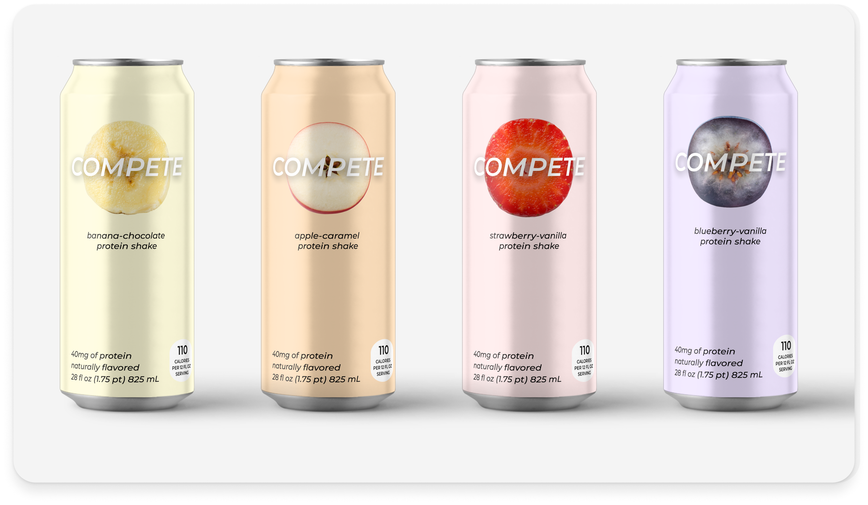
Lastly, I used each fruit's color for the background of the protein shakes. The colors emphasize the main ingredient
in the shakes. Each fruit's color for the background of the protein shakes help customers identify the different flavors of each product.
I wanted to show which fruit each drink had by adding a slice of the fruit on the packaging. This also emphasizes the natural flavors and ingredients in the drinks.
Sports Drinks
Pre Workout Energy Drinks
Protein Shakes