Alara Kalfazade
Grace Chen
Haruka Masamura
Zeynep Aydin
Researcher & Designer
October 2022 (3 weeks)
In this project, I redesigned an interactive interface for startup "Hello", a search engine that is optimized for developers and technical questions. I created a prototype tailored to streamline technical inquiries, redefining the search experience for developers. I went through the full process of mocking up a solution to the startup's concept.
Hello is a search engine that is optimized for developers and technical questions. It answers questions with simple explanations and code snippets from the web instantly. Hello uses AI language models to quickly generate answers based on multiple resources.
The intended audience of hello consists of developers and computer science students/ professionals. They can use hello to receive fast answers to their technical questions. Because of the coding nature of the startup, we chose to design a desktop interface. Using this as a jumping-off point, we had discussions to decide which features would be the most beneficial for our website.
The following were concluded:
To get the ideas flowing, each group member made quick hand-drawn sketches.
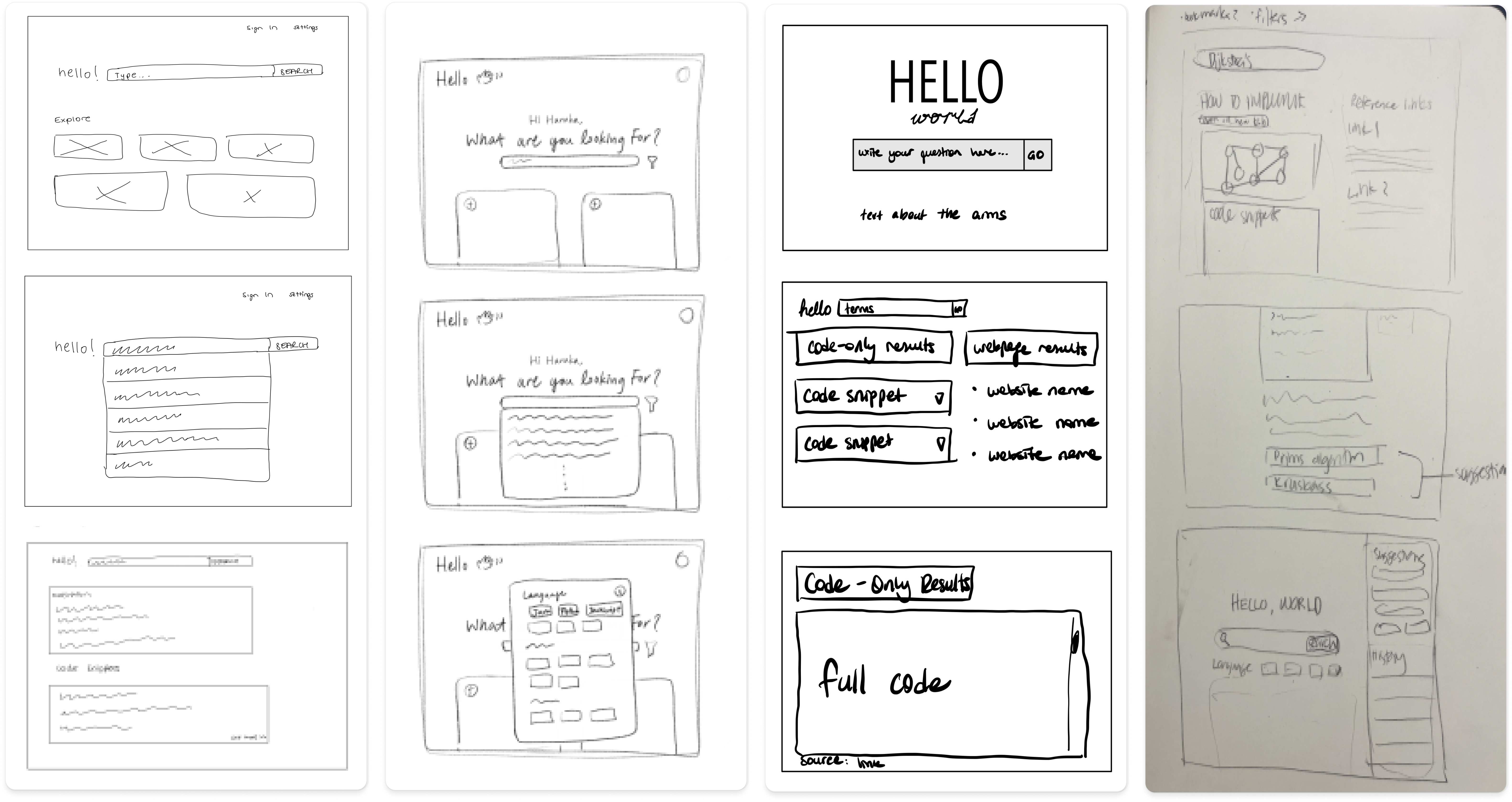
After the sketching, we came up with a new design to demonstrate the goals of the startup in the best way possible. We aimed the design to be simple, intuitive, and easy to use. Furthermore, we wanted a clean yet unique look, which separated our startup's project from other search engines available.
After the sketching, we came up with a new design to demonstrate the goals of the startup in the best way possible. We aimed the design to be simple, intuitive, and easy to use. Furthermore, we wanted a clean yet unique look, which separated our startup's project from other search engines available. We used Figma to create the low-fidelity wireframe of our design.

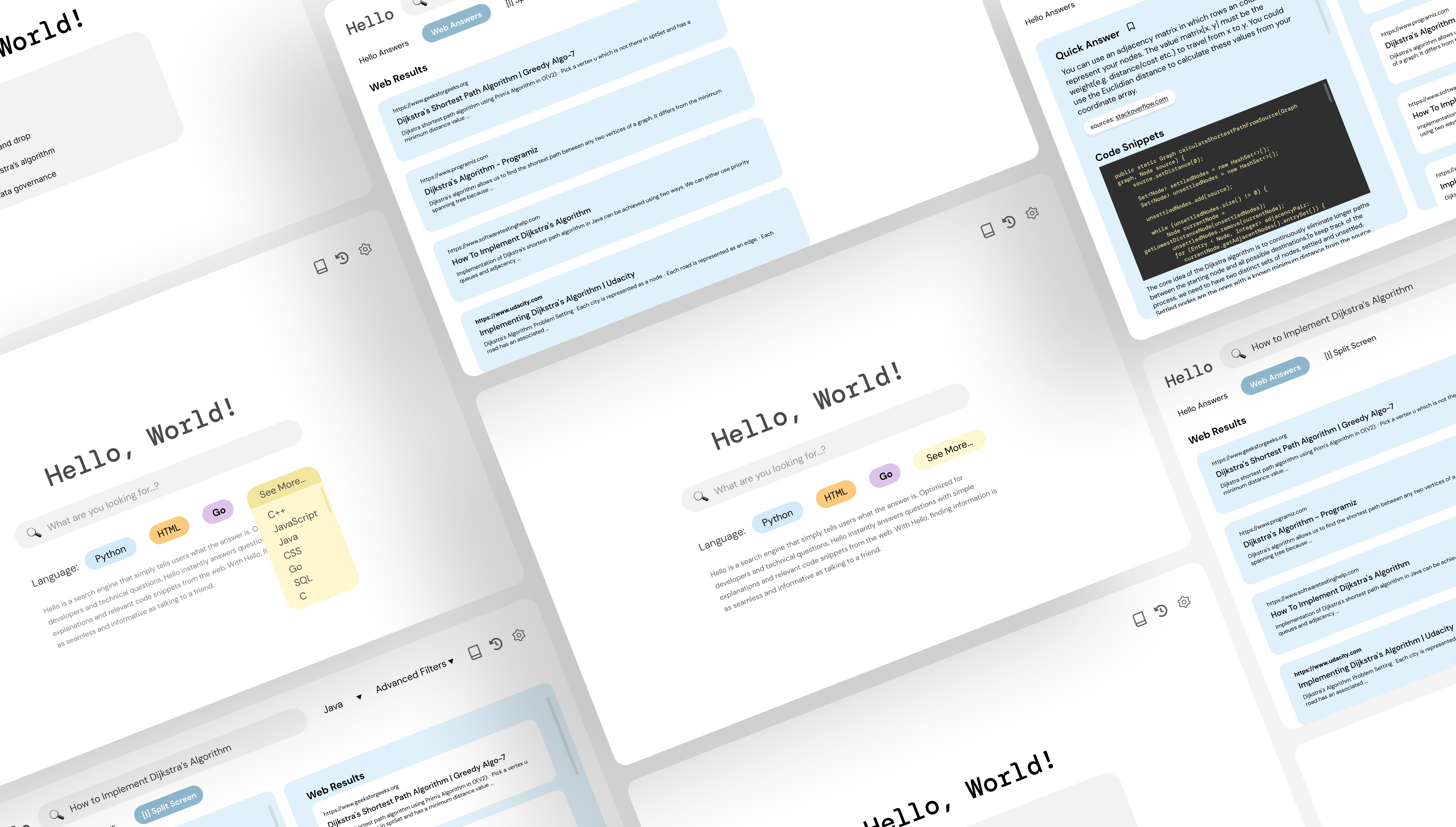
Using Figma, we created our first interactive high-fidelity prototype. While making our design, we choose a clean look with minimal distractions. The chosen fonts reflect the startup's technical nature. We paid special attention to text hierarchy and color scheme to make our page easy to read and navigate. By using contrasting colors, such as black text on a blue background, we made the font more visible so that anyone could read the website. We chose to use icons on our website to express possible actions, such as bookmarking and history, to grab the user's attention and help the users find the content they are looking for. We made sure to use icons that the user can easily understand. We added a split screen option for users to view 'Web Answers' and 'Hello Answers', which are generated simultaneously by hello's AI algorithm.
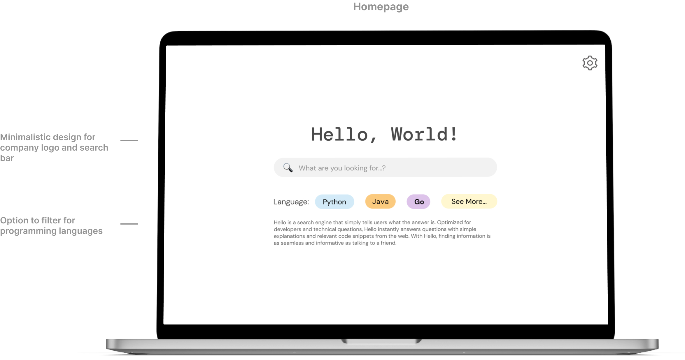
On the homepage, the user can start their search by clicking 'see more' and choosing a programming language from the drop-down menu. The drop-down menu has different language options to choose from. Afterwards, the user can type in the question in the search bar. This would then lead them to the split screen, where the user can see both Hello's quick answers and web results.
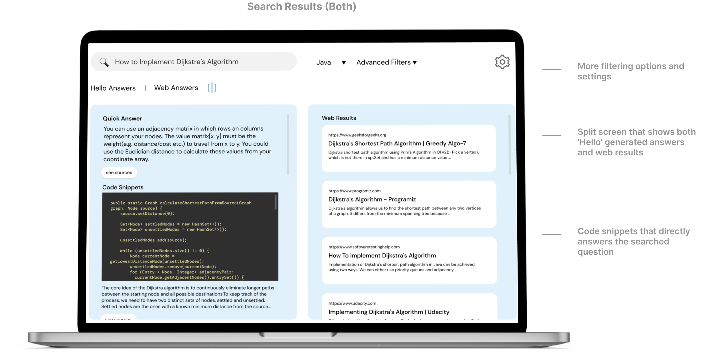
On the split screen, the user can view both Hello's answers and regular web results. On the 'Quick Answer' section, a short definition which answers the question asked and code snippets are given. The user can click on 'view source' button to see which resources were used when generating the quick answers. On the 'Web Results' section, the user can view further resources if they need.
Moreover, the user can switch between 'Hello Answers' and 'Web Results' when they want to see only one section at a time. The user can change the intended programming language from the drop-down menu. They can see the options by hovering their mouse over the filter.
With a functioning and updated prototype, we wrote a task and carried out usability testing to analyze which difficulties might exist when the user interacts with the interface. We asked the users to imagine themselves as a computer science student and search for “how to implement Dijkstra's algorithm” by following some task instructions which we have given. We asked them to verbalize their thoughts throughout the testing process. We informed them that they would not be using an actual website but instead testing an interactive mockup.
The testing instructions were the following:
Overall, the UserTesting results were in line with our expectations. The users didn't have difficulty in completing the tasks and found the design intuitive. The users generally understood the layout and purpose of the website just from looking at the homepage. Some thought that the split screen was effective and helpful. The users also mentioned that the answers generated by the algorithm including the quick answer and the code snippets met their expectations. They appreciated the minimal design of 'Hello Answers' page as there were no distractions. Some users mentioned that they were expecting to be a profile button on the homepage. They also added that they wished to see more languages for filtering.
Based on the feedback, we would definitely give less space to the web results. It was mentioned multiple times that the main draw of the platform is the hello answers, so the web answers can be deprioritized since users can just go to Google if they wanted that. Additionally, we could include a dropdown arrow after a language is chosen from the “see more” dropdown to show that users can change languages if they make a mistake.
Using Figma, we created our first interactive high-fidelity prototype. While making our design, we choose a clean look with minimal distractions. The chosen fonts reflect the startup's technical nature. We paid special attention to text hierarchy and color scheme to make our page easy to read and navigate. By using contrasting colors, such as black text on a blue background, we made the font more visible so that anyone could read the website. We chose to use icons on our website to express possible actions, such as bookmarking and history, to grab the user's attention and help the users find the content they are looking for. We made sure to use icons that the user can easily understand. We added a split screen option for users to view 'Web Answers' and 'Hello Answers', which are generated simultaneously by hello's AI algorithm.
Below are some issues identified after asking for critiques to identify potential problems with the high-fidelity mockup:
The following changes were made to the initial high-fi mockup after receiving feedback: