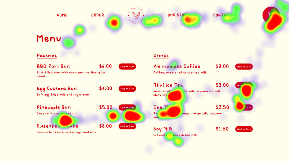
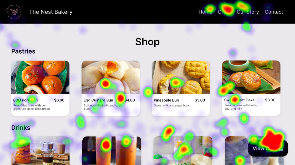
Design Presentation

Eyetracking

Team:

Alara Kalfazade

Grace Chen

Haruka Masamura

Yuki Hayashita

Role:

Researcher & Designer

Timeline:

October 2022 (1 week)


Introduction

Eyetracking is a group project I have taken a part of during CSCI1300: User Interface and User Experiences course at Brown University. In this project, we designed two different versions of a website and used eye tracking method to evaluate the usability and the efficiency of each design.


Planning The Changes and Formulating Hypothesis

Bakery Homepage Template

Our task was to examine the bakery homepage template that was given by the teaching assistants (TAs) and to think about how we could change this template to create two new versions (A and B) of the bakery website.

The TA template of the bakery homepage can be viewed below.

TA Homepage Template

While we were discussing the changes we could do, we considered principles including usability and efficiency. We wanted to make sure that both Version A and Version B exhibit changes from the original template and are different from each other. We also aggreed that the two versions should serve a similar goal by making the page more visually engaging and providing more information. Therefore, we concluded to do the following changes:

  • For Version A:
    • Changing the color theme and the text font
    • Changing the placement of the navigation bar
    • Adding the list of items on the homepage
    • Adding 'Add to Cart' button next to item price
    • Adding 'Cart' icon on top right corner
  • For Version B:
    • Changing the placement of the navigation bar
    • Adding the list of items on the homepage
    • Adding images for each item on the menu
    • Adding a 'View Cart' button on the bottom right corner

Hypothesis

We predicted that user who is looking at Version A would find the cart and their items faster, because Version B has the cart on the bottom right corner instead of top right, which is where it usually is. Moreover, the user might spend more time looking at the photos since Version B has images for all the items on the menu.

We also assumed that both webpages would be easy to use and learn. The user who is viewing both of the designs for the first time would not be confused and find them intuitive.


Redesigning the Website

Version A

We chose buttery white (#FFFCEB) for the background and cardinal red (#C62424) for the font. For the font-family, we decided to go with 'Kiddie Regular'. We wanted to make this version visually more interesting by choosing fun colors and font.

For efficieny, we made sure that the user can reach their goal as quickly as possible. Therefore, we designed Version A so that it requires a minimal time to execute an action on the website. In order to make it easier to view the cart, we added a cart icon on the top right, which is where the cart icons or buttons usually are. We listed all the items on the menu with their descriptions and prices on the homepage. We added the 'Add to Cart' option next to each item so that the user can add an item to their cart faster. Lastly, we put the navigation bar on top.

Version A's Design

Version B

We chose light grey (#E8E8EC) for the background, black and white for the font color and 'Inter' for the font family. We wanted to keep this version more simple by choosing mostly used colors for the theme.

We put the navigation bar on top again. Different than Version A, we decided to locate the 'View Cart' button on the bottom left corner to see if it effected the time to complete a task. We listed all the items on the menu with images on Version B.

Version B's Design

Conducting Eye Tracking Tests

Eye tracking is a technology that detects people's eyes and follow what they are looking. It is a method used to measure where people are looking and for how long they are looking. It converts the eye movements in to data streams, which can later be converted into heatmaps. Through this, the testers to see their designs through the user's eyes and have deep understanding of visual attention.

Heatmap Generation

To conduct out eye tracking tests, we brought two people into the lab, where the eye tracking camera is, as test participants. These two people were not be members of your group.

Before we started the test, we gave both of our participants a task to perform when they are looking at the designs. The task was to add one pastry and one drink to the cart and view the cart by just looking at the screen, tracing the task with their eyes, and not touching the mouse. Each participant only tested one version. The camera collected data and tracked their eye movements when they were completing the tasks.

After conducting our tests, to analyze the eye tracking data, we generated heatmaps (a still image that depicts where our test participants' gazes were fixed) and animated replay of their gaze motion, both overlaid on the design so that it is showing what interface elements test participants were looking at. We used the stencil code given by the TAs to generate a heatmap and a replay for each version. The stencil file rendered an animation of the eye tracking path of the user using circles on top of the design.

Version A

Version A's Eye Tracking

Eye Movements

This file is an animation of the eye tracking path of the user using circles. By looking at this, we can say that the user did not have any difficulties choosing the items they wanted and adding them to the cart. From the eye movements, we can see that the user adds 'Pineapple Bun' and 'Thai Ice Tea' to the cart and then views the cart icon. Later, the user looks through the navigation bar.

Version A's Heatmap

Heatmap

Version B

Version B's Eye Tracking

Eye Movements

We can examine that the user looks at most of the items on the menu before looking at the 'View Cart' button. After adding items and viewing the cart, the user looks at the navigation bar.

Version B's Heatmap

Heatmap


Final Results

Did The Results Match Our Expectations?

We predicted that user who were looking at Version A would find the cart and their items faster because the cart is located on the top right, which is usually where it is located. Since Version B has the cart on the bottom right corner instead of top right and has images for all the items on the menu, the user took more time browsing the pastries and drinks before looking at the cart. The images for each item attracted the user's attention; therefore, the user evaluated the items not just by reading the descriptions but also by looking at the images before choosing and adding them to the cart. Our results matched our expectations and our hypothesis since the user who viewed Version A only looked at two items on the menu and added them directly to the cart, whereas the user who tested version B looked at each of the menu items before viewing the cart.

Even though the user who tested Version B took longer time to complete the task, the user still found the design easy to understand and learn. Both users knew where to look at on each step when they were completing the task. They found the designs to be straightforward to navigate, which helps the users find what they need. The designs were also engaging for the testers. The color choice of Version A and the images on Version B contributed to the attractiveness of the designs.